KARIN DARSA

Shahar Avnet is an Israeli artist and fashion designer successful all over the world.
In this project, I redesigned her
E-commerce site.

What
Redesign E-commerce site | Concept project
Role
Ux | Ui | prototyping | illustrations
When
2021

01
Why shahar avnet
Shahar Avnet is a luxurious fashion & art brand located in Tel-Aviv. The designer is creating couture garments, evening wear, bride dresses, "ready to wear" clothing and different art works.
The brand had participated in fashion weeks in Paris and London and dressed many "celebs" such as Beyonce, Zendaya, Christina Aguilera, Elizabeth Moss, Maya Musk, Iggy Azalea, Noa Kirel, Netta Barzilai and many others.
Shahar Avner Is representing an interesting, contemporary, Israeli fashion, that's why I choose to focus in it.
When I was going throw the existing site, I found many problems, so I loved the challenge of redesigning it.


02
The Problem(s)
While going throw the site I noticed many problems, some of them were technical and some are because the interface was very unfriendly and unclear.
The brand specializes in "Haute Couture"garments with many small details. The site doesn't give the proper attention to the cloths, the photos are too small, and the user can't see the beautiful details in every garment.
When buying clothing online in such high prices, the user should be able to see everything clearly.
The site does not put any emphasis on showing the "celebs" wearing the cloths, influencers are always a strong selling point, and it's a shame not using them.
In general, the site menu is organized quite reasonable, but besides that both Ux and Ui need a lot of improvement.


03
competitive research
My market research focused on checking the competitors, what are their weaknesses and strength. During my research, I focused on 3 competitive sites:
Alon Livne
Yaniv Persy

Dror Kontento
Weak Points
• Confusing site and menu orientation.
• User have to sign up to add to favorites.
• No brides tab.
• The evening dresses do not appear in the shop.
• The menu says "online" instead of "shop" confusing and unclear.
Strong Suits
• Hero image gives a luxurious and trendy feeling, and allows watching clothes details.
• Using "celebrities" in the front page.
• Usage of light boxes to highlight items.
• Enlarging photos option.
• Favorites option.
• Size chart.
04
users research
A good site is one that knows its target audience, while trying to get better understanding of the needs of the target users I posted a questionnaire to many people, I focused on social groups of Israeli fashion lovers and online fashion shoppers of Israeli designers.
193 people gave me a look into their online shopping habits,
and here are some of the main conclusions:
48
%
Prefer buying in a physical store
Only 18% preferred buying online.
30
%
Mentioned the reason for not buying Israeli designers is the high price.
61
%
Buy Israeli designers to find daily clothing with some uniqueness.
72
%
Said they use the size chart if the site
has one.
96
%
Look for bride/evening dress online but purchase it in the physical store.
42
%
Show interest in a large size range.
The research results led to many conclusions:
The average Israeli fashion consumer is relatively young (around 30) educated woman with an high income. Although her high income she still give the price a great importance.
That means that an emphasis on daily clothing and sale section is important.
Most of the women showed clear preference of buying in the physical store.
That shows the importance of giving the user as much information as possible:
• big clear photos, emphasis on showing clothes details and giving the user the option to enlarge the photo.
• clear size chart.
• easy return policy.
All these will help giving the user a better online shopping experience, and will assist enlarge the online sale numbers.
05
wireframes, flow and information architecture
The research left me with a lot of information about my potential users, their needs and their problems that were not solved by the competitive sites.
Then I had to realize how to organize all these conclusions into a convenient friendly interface.
Analyzing my main personas, understanding what are their main needs and creating their main flows.
Deciding which features to include in the site information architecture and deciding on the site structure.
The site map and wireframes helped me organizing all that information into what will become a great site.

06
The Product


My structure and color choices for the site were intended to highlight the beautiful clothes which are the heart of the site.
And create a young, fun and playful design.
The selected colors came from the designer's collection color palette.
F4BAAD
FC1D63
F36F0E
FBE30B
6DD176
0768EF
41114A7
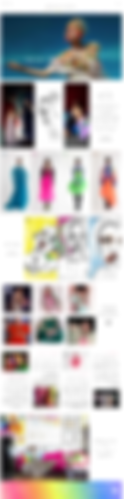
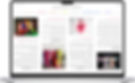
Home page that makes you want to shop now!

The home page main goal is to be very attractive, appealing to the users and very aesthetic. The clothes are shown with all their glory to lure the user in.
The changing hero image gives the user a taste of all the designer's products.
After that, the user can scroll down the long home page and learn more about the designer and her products.
The home page is made of 7 different sub-pages:
• The hero image.
• The new collection atmosphere Photoshoot.
• The new collection pack shots.
• The art new collection.
• The designer's instagram feed.
• Latest press releases.
• The studio.
In almost every part of the home page there is a call for action in a "shop now" button, each time the button will lead to the specific items for sale.
In the Header of the page, there is a clear mega menu to help the user get exactly where they want very easily.
In the footer there are all the contact details and an easy subscribe button.
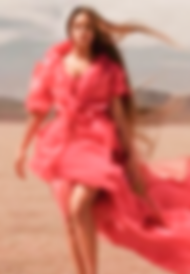
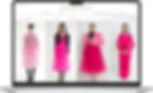
1. The Hero Image

The hero image is what the users see first when entering the site.
The main goal is to lure the users in, to make them desire the items for sale and not let them leave without buying something.
Shahar Avnet has many small details in her clothing, so having big clear photos that show all the details has great importance.
The hero image is changing every few seconds, it starts with the new collection, pass to the sale, then "haute couture", and last bridal dresses.
The user can see all the variety of items from the designer and at the same time get the fun, creative spirit of the brand, and get impression of all the "celebrities" wearing her clothes, which makes the brand even more desired.
2. The New Collection Atmosphere Photoshoot
In this sub-page, the user can see running photos from the new collection,
The atmosphere photo shoots give the user the general vibe of the collection.
The user can also read few words about the new collection and about the inspiration for the collection.
In the bottom of the page, there is a call for action button that invites the user to shop the new collection.
3. The New Collection Packshoots

In this sub-page, the users can see clear photos of the clothing, when going throw the photos they can see the photos enlarged and see all the small details of the clothing.
The users can also mark their favorites so they can shop them later easily.
4. The Art New Collection

In this sub-page, the user can see a taste of the new art collection, when going throw the photos they change so the user can see how they look framed.
The user can mark favorites for easy access for shopping them later.
In the bottom, there is a call for action button for direct shopping of the art.
5. The Designer's Instagram Feed
In this sub-page, the user can get a taste of the brand's instagram feed, he can move directly to the brand's instagram page by clicking the instagram icon.
6. Latest Press Releases
In this sub-page, the users can read the latest press releases about the brand, they can read more thoroughly by pressing the continue reading button.
7. The Studio

In this sub-page, there is a big photo of the studio and the designer to get the user feel the brand's vibe.
Since a big part of the brands sales are couture and bridal dresses that requires the client coming to the studio it is very important to give easy access to the contact information.
The menu

The mega menu is designed for easy and quick access to all the menu's parts.
It is divided to 7 main parts:
• Shop - quick access to the site's store, there there is a division to clothes that can be bought directly from the site and to clothes, the user can order and come for a fitting in the studio, if it is "haute couture" or special sizes.
In the "ready to wear" clothes, the user can choose from buying by collection, by category, by size, by color or sale.
• Collection watching - the user can see all the brand's collections in atmosphere shooting.
• Brides - the user can see all the bridal collections and set an appointment for fitting in the studio.
• Art - the user can choose from: digital art, original art, fashion illustrations and sale sections.
• About - the user can choose from: about the designer, the brand's blog and the brands upcoming events.
• Press - the user can choose from articles about the brand and photos of "celebs" wearing the brand's clothing that appeared on the press.
• Contact - the user can choose from the studio information and the list of boutiques that owns the brand's clothing.
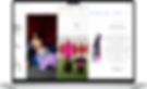
product page

In the product page, the users see big clear photos of the cloths, with an option to enlarge the photos, they can favorite the item, choose a size, see the size chart to understand which size they need, read the description of the item, and check the return policy.
Then they can add the item to the basket.
At the bottom of the page, they can see other items that they may like as well.
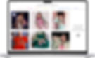
search results page
In the search results page, the users see all the items matching their search words, they can make an even more specific search by filtering: kind of shopping experience (if it is buy now or order and make an appointment), category, color, collection and size.
Users can also sort the items by "high to low" and "low to high" prices.
